Monday, October 27, 2008
I'm so sorry I haven't been able to post for a while. I did start school, which takes up most of my time. (And homework of course.) But that won't stop me from doing what I love. So I hope you enjoy this outburst of drawings I've done recently when I have free time. I've done a lot of pencils, many others, so I don't post most of them because it's hard to see. Thank you for your time. E.X. PS This is how I sign my work: E.X.
Fruit Drop for Halloween.
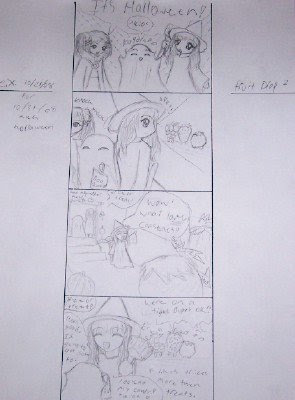 I've started (and this time am actually finishing) a little story called Fruit Drop. This is one that I'm going to put on my binder for Halloween day.
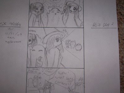
My mom particularly liked this little panel of the berries standing there with their little feet.
Work (other than manga).
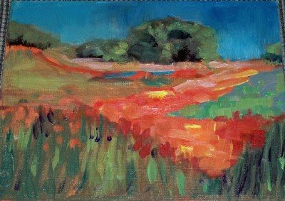
This is a landscape I painted at my teacher's studio. It is in oil and took a long time to dry:
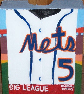
 Halloween is coming and so I made this design for my sister's costume. She wanted to be a David Wright (NY Mets) baseball card, and this is based on a 2007 Goudey for those of you who might know baseball.
  I'm going as a witch.
 Halloween is coming and so I made this design for my sister's costume. She wanted to be a David Wright (NY Mets) baseball card, and this is based on a 2007 Goudey for those of you who might know baseball.
  I'm going as a witch.
 Artwork for others.
I started taking requets from people in my class for drawings they would like. I'm only allowed to do this when I've done all my homework and art classes. These also serve as binder covers. This one I did for Amani: 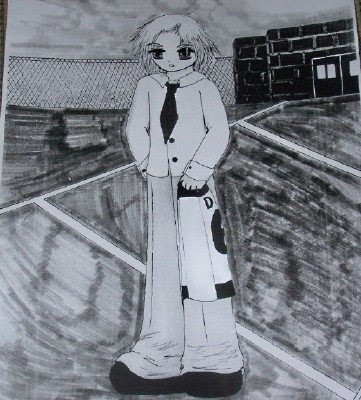
This is the one that I actually gave her; the colored one is the drawing I kept: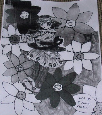 This is one I did for Selena. I based it on a character I saw in the book Kamichama Karin Chu by Koge-Donbo:
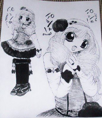

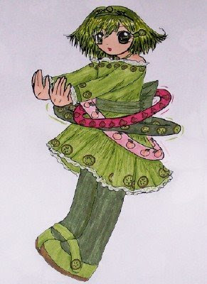
Amani's sister asked for a drawing because she liked Amani's. She asked for a girl with short hair hula hooping. This character's name is Kiwi:

This is the one that I actually gave her; the colored one is the drawing I kept:
 This is one I did for Selena. I based it on a character I saw in the book Kamichama Karin Chu by Koge-Donbo:
Spellbinder binder covers.
Saturday, September 13, 2008
Binder cover.
Binder cover.
Contrast warm and cool colors.
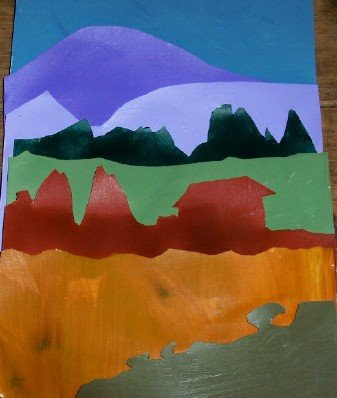
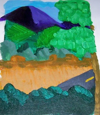 This was an assignment (see below) I had from my art teacher. It's the view outside my school's art room; the medium is acrylic on canvas.
Divde your canvas into thirds--horizontal and vertical--so that you have 9 squares. Decide where your focal point will be: it should not be in the center, but at the inside corners of one of your outside four squares that came from the thirds when you divided up your canvas.
For this exercise use the bottom line of the top 3 squares as your horizon (mountain, trees, whatever you decided). Use the bottom line of the top six squares as a line to set your center of interest (focal point). Not in center of canvas.
Cool colors recede, warm comes forward. Be aware of your light source. Keep a clean paint brush...a paper towel in the hand without the brush. Don't rush, take your time and think. Make a distinct choice or on shadows, remember a middle value on a tree can be a littler warmer because it's closer to us. Also think in terms of complements in shadows, and where we want to dull a color to make a color next to it brighter.
Variety: to stimulate interest, we need:
contrasts (light, dark, half tones)
color (cool, warm, bright, muted)
shapes (different; large and small)
Sunday, August 31, 2008
Hayao Miyazaki.

My favorite animation artist and director Hayao Miyazaki appeared today at the Venice Film Festival. He is 67 years old. His new animation is called Ponyo on the Cliff by the Sea and it's a big hit in Japan. The voices include actress Yuki Amami andTomoko Yamaguchi and actors Yuria Nara and Hiroki Doi. This movie is competing for a big prize in Venice. The story is from the Hans Christian Andersen fairytale The Little Mermaid (not the Disney version) and is about a goldfish who wants to be human so she can be with her love, who is a five-year-old boy named Sosuke. This is the best part: the animation uses hand-drawn art throughout. No computer animation!
Photo: Denis Balibouse/Reuters
Saturday, August 30, 2008
A lesson in color.
Still life.
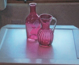
My teacher gave me these reminders for how to do a small still life, 6" x 8" using acrylics:
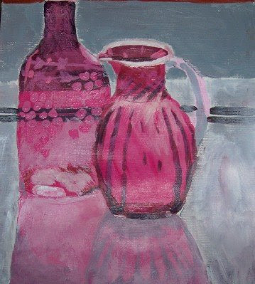
set up at least two objects; they should overlap each other slightly. Shadow areas on objects should be made up of the local color of the object. For example, the red of an apple plus a small amoung of the complement of red. The cast shadow and object shadow should be two different values. He told me to "think composition": the main object should not be in the center of the page. Above is a picture of what I was looking at, and here's what I did:

Labels:
acrylics,
cast shadow,
object shadow,
shadows,
still life
Self portraits.
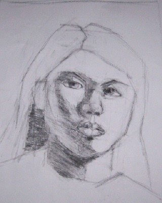 These are two self portraits that my teacher had me do. The one above I did in his studio. Here are the instructions I got: use charcoal; 10x12; remember how to hold the implement (the medium is charcoal); make a series of straight lines; do measurements. How wide is the nose compared to the eye? Where does a straight line from edge of eye intersect cheek, chin, neck? Keeping those questions in mind I did this one at home:
Labels:
self portraits,
straight lines,
using charcoal
Tuesday, August 19, 2008
Sunset.
Back to school again.
Worry color session.
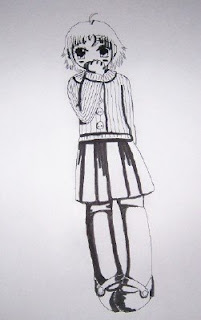 This is the second lesson I've done. It's how to color my way. You don't have to listen to it, but if you look at it that would be nice. First you draw a picture, then you pen and print it. Add all the shadows.
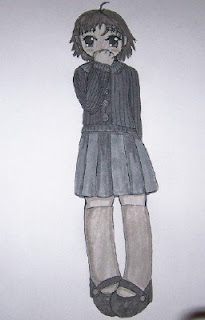 When you start the coloring process, you have several choices. One is you can do it all in one color, with different variations in shading. I did this one in gray.
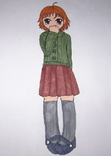 If you do different colors, you ought to tie them in somehow with each other. These are all muted base colors.
A picture for a friend.
A day at the beach.
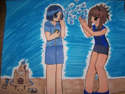 This is a splash page that I did of two characters in my comic Spellbinder. On the left is Gyro, and on the right is Chi.
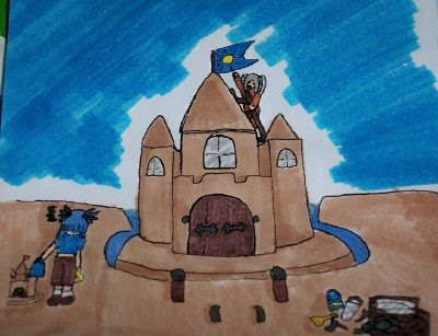 These are their spellbinders, Aquamarine and Stone. They were having a sand castle contest, and since Stone's specialty is ground, she was able to make an actual house out of sand. The tools that you see on the lower right hand side are what she used to make the house all furnished and complete looking. And Aquamarine made the smaaalll castle you see on the lower left. She's kind of competitive so she wasn't very happy with that.
Labels:
Aquamarine,
Chi,
Gyro,
sand castle,
Spellbinders,
Stone
Rabi-en-rose.
Pisces and Aquarius.
Sunday, August 10, 2008
Thorn and Syth.
Saturday, August 9, 2008
Art by friends and me.
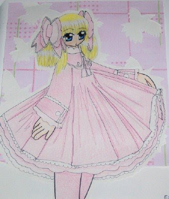
These are also comparisons, like the post below. They are all studies in pink. The one above is mine.
Labels:
art by friends,
desertplume,
hopper,
kiyomi,
manga styles
Our different styles.
Wednesday, August 6, 2008
Lavender.
Sunday, August 3, 2008
Ying and Yang, versions one and two.
Starly.
Subscribe to:
Comments (Atom)


